Vision
The dawn of Lancelot
The first project of mine named Lancelot was a simple SuperKaramba applet that displayed a set of icons representing categories under which applications reside. The point was to reduce the clutter on the desktop. It was only meant for personal use and was never published. (maybe some day I'll make it for Plasma under different name)
The real Lancelot started as port of the old one to Plasma with some modifications. At first, it was not meant to be an all-in-one ALI (application launching interface), but then something happened - it was mentioned in the commit-digest (thanks Danny) as the 'next-gen ALI' and The Hype was born (that was the First Significant Moment mentioned in the Book of Lancelot :) ).
I still didn't want to make it something more than I had originally planned, but then the Second Significant Moment happened - it was decided that the default ALI for KDE SC 4.0 will be Kickoff. Unfortunately, the Raptor development team was not fast enough to make Raptor ready for 4.0.
I really did not want to use Kickoff, so I decided to do a little research seeking various ALIs and ALI mockups on the internet. I saw a couple of interesting ideas (TastyMenu, Gimmie...) that didn't quite fit what I wanted to do, but had influenced me.
Basic idea
The main idea behind the Lancelot development was to experiment with alternative user interfaces. The aim was to create an interface in which you don't have to make a single click to do what you want to do - to navigate and start applications just by moving the mouse.
There were basically two ways to do this - to make the items react to hovering for a specified amount of time. Hovering is a good solution since it is easy to do and understand. The downside is that it would induce too much accidental 'clicks'.
The solution was a concept of item extenders (not to be confused with Plasma's most wanted feature introduced in KDE SC 4.2). When you hover a button, you get a small extender on one side of it. When you hover the extender, the action is performed. The downside to this approach is the fact it is less intuitive (but not much), and that it is slower.
So, to make using Lancelot as fluid as it can be, the items that do internal things in the menu itself (switching categories for example) are hover-activated, and any application launching or similar is done via extenders.
Naturally, clicking also works if you like to click.
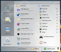
The menu layout is vastly induced by the no-click idea to minimize the possibility of accidental actions invocation. It is designed to allow each action to be performed in one smooth mouse gesture called "action flow line".
Features
As far as the features are concerned, Lancelot is supposed to include most of the needed features - contact lists, storage device manipulation, document oriented approach, and last but not the least, KRunner and Strigi integration.
